A dentist who paints, and a website that finally looks like his practice
Winchester Family Dentistry asked for two things: watercolor that felt like real paint, and a site that turns visitors into phone calls. We built both, moved all 41 pages off a template, and made sure every old address that ever earned a search click still lands on a live page.
“It was like we were making jazz music—laying down beats and sounds that GoodBibee took and put together into a masterpiece.
They care enough to understand you and your vision and bring it to life in a way that reflects YOU.”
Where they were
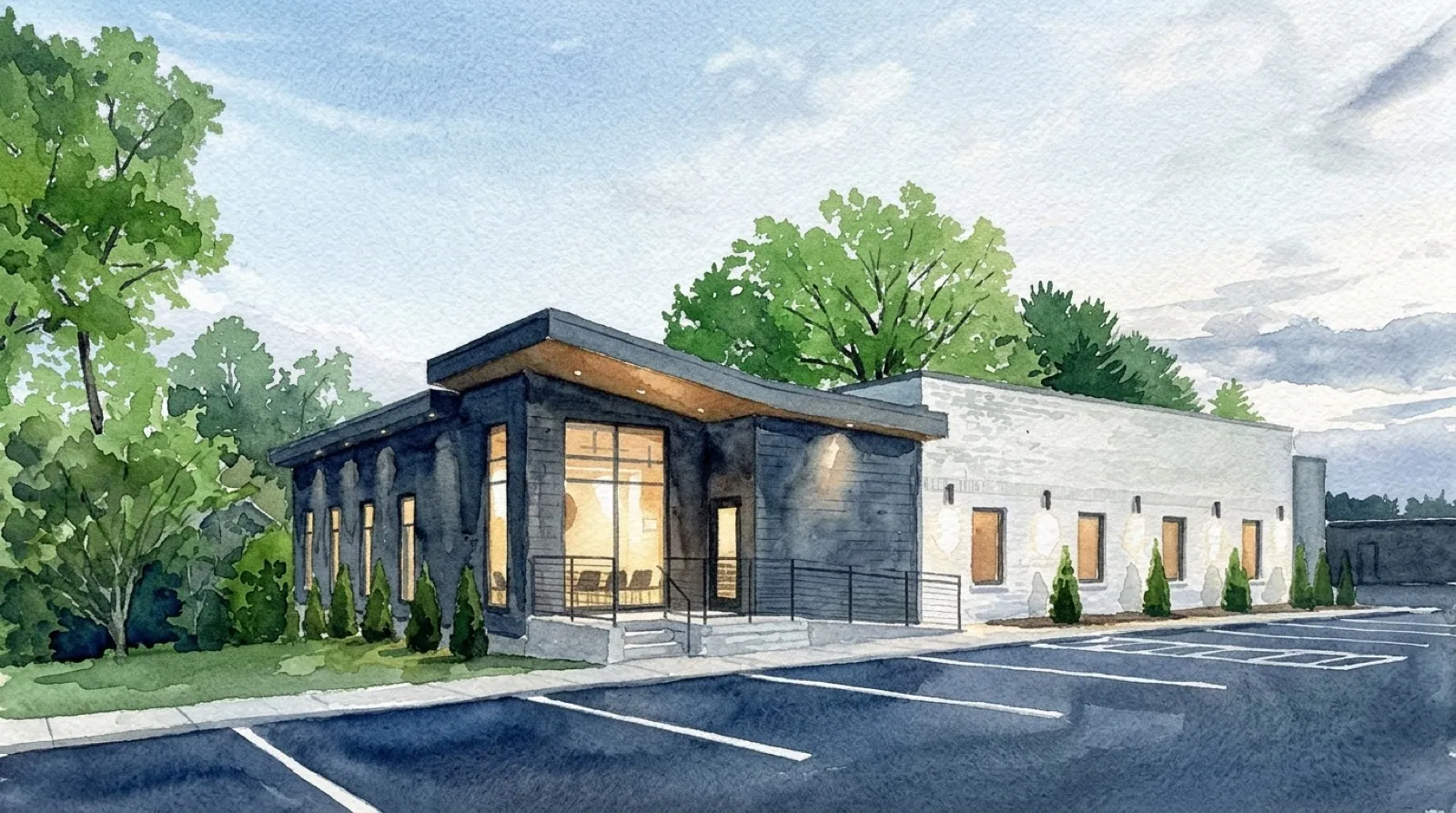
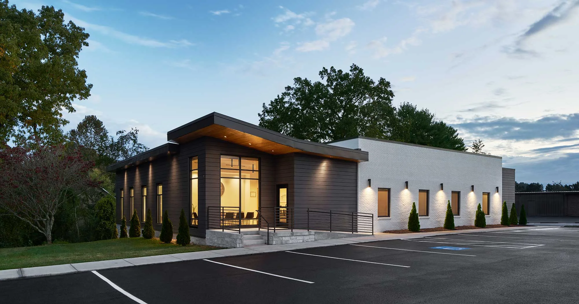
Dr. Garrett Orr has run Winchester Family Dentistry since 2011. Patients drive in from ten towns for work their neighbors would otherwise go an hour for: implants, sedation, full-arch cases. He paints, and the practice’s own logo is a small painted landscape, so the family wanted the website to carry watercolor.
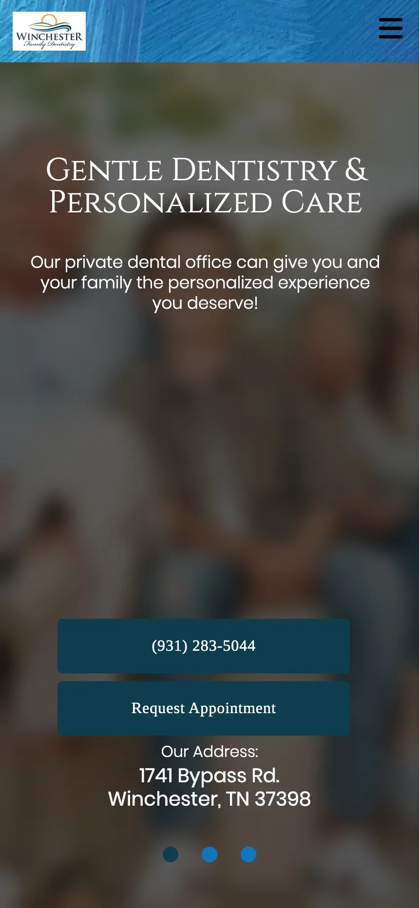
The old site was a dental marketing company’s template. Its idea of watercolor was hard blue brush strokes behind every page and a stock landscape beside the address. It had 485 web addresses, 98 of them near-identical service pages, and a home page that blurred its photo under white text. It did not look like the office, and it did not make it easy to call.
My previous provider did not seem to provide good value for the money, particularly with ongoing changes after the site was established.
What mattered to them
- That it look like them: the paint, the building, the people.
- That patients pick up the phone.
- That nothing they had earned on Google got lost in the move.

The home page, before and after
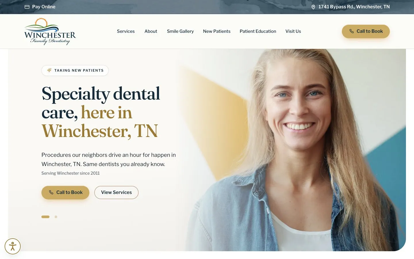
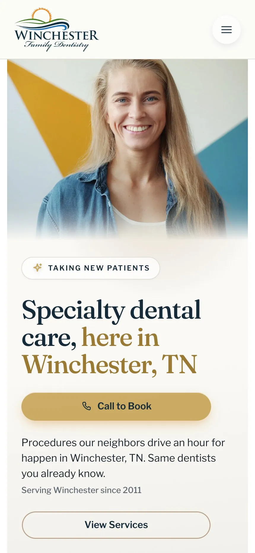
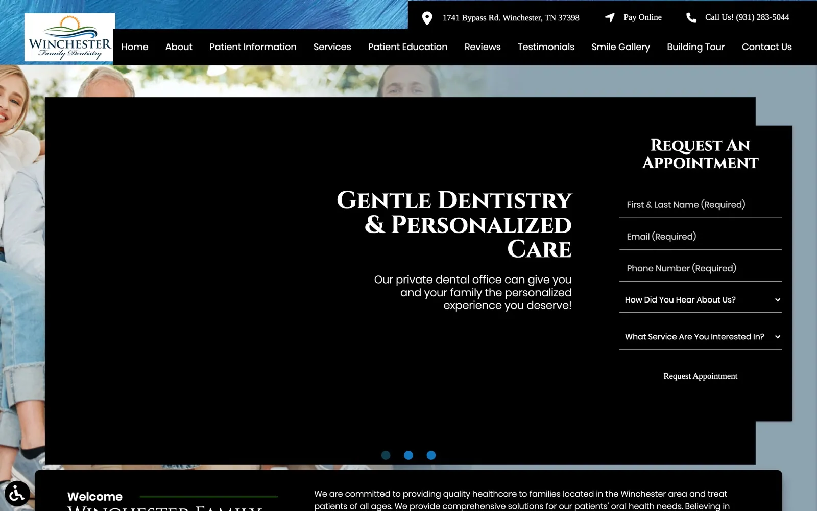
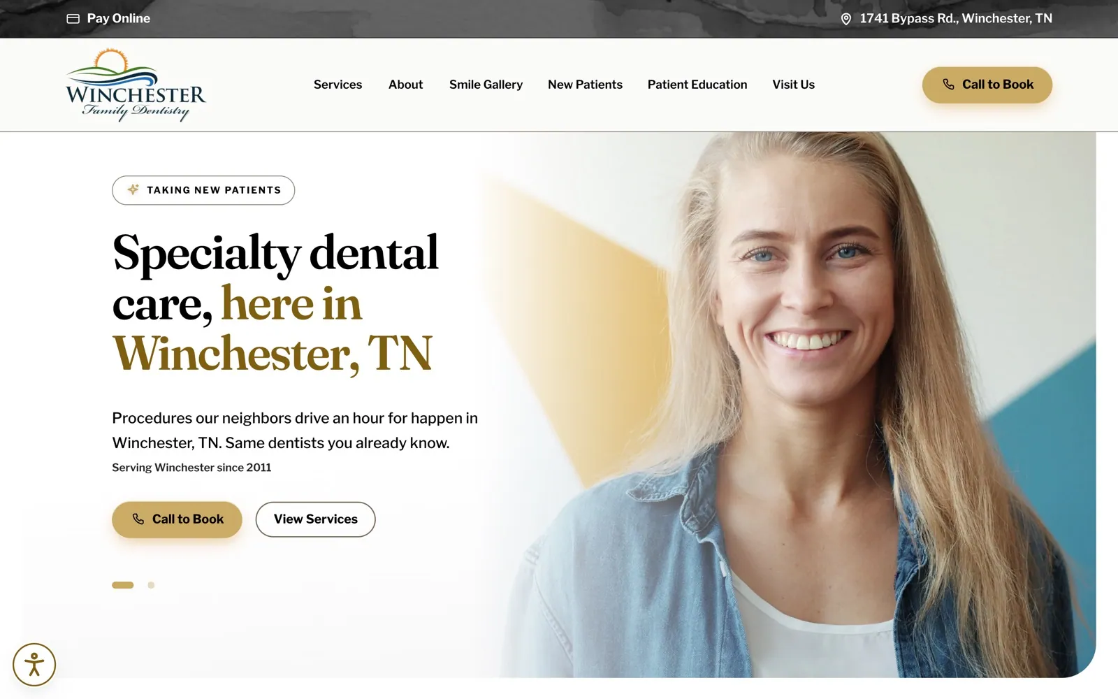
Old home page: a family on a couch, a blue banner and a request-an-appointment form. New home page: a smiling woman and the headline Specialty dental care, here in Winchester, TN.
Scroll down. The old home page gives way to the new one.
The strategy: keep what earns, consolidate the rest
Before designing anything, we checked all 485 addresses on the old site against its Google data, to see which pages people had actually clicked on from a search and which had links from other sites.
Every page people clicked on was kept. The ones that mattered most were rebuilt, and the rest now send visitors to the right new page. The 283 addresses we retired had no clicks from search and no links from other sites.
GoodBibee has done an excellent job of merging our vision with SEO that works and keeps us in the loop, even when we are hard to get a hold of.
- 21rebuilt as new pages
- 181redirected to the right new page, including 98 near-identical service pages consolidated into one page per service
- 283retired: media and system files, none with a search click
Watercolor with a job to do
The old site took the family’s wish and put hard brush strokes behind everything. We wanted the paint to feel like paper and water, and to be there for a reason each time it appears.
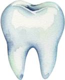 Marks the patient questions
 Marks the patient articles
Before
Now

The header, theirs and ours
One thin painted strip at the top of every page, and the logo straight on the paper instead of in a white box. The paint says “this is the same practice as the sign out front” and then gets out of the way.
Decherd · 5 min 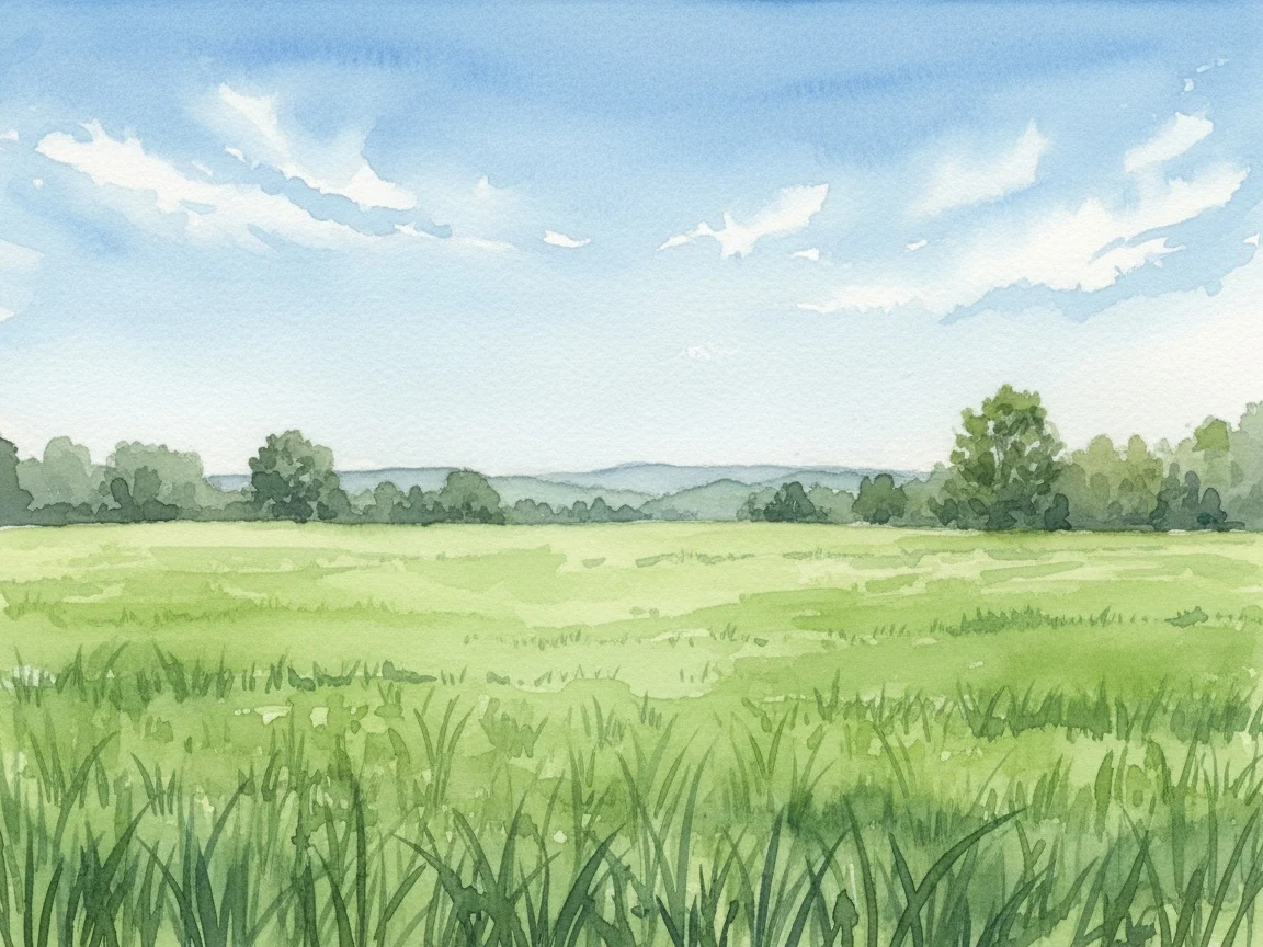
Cowan · 10 min 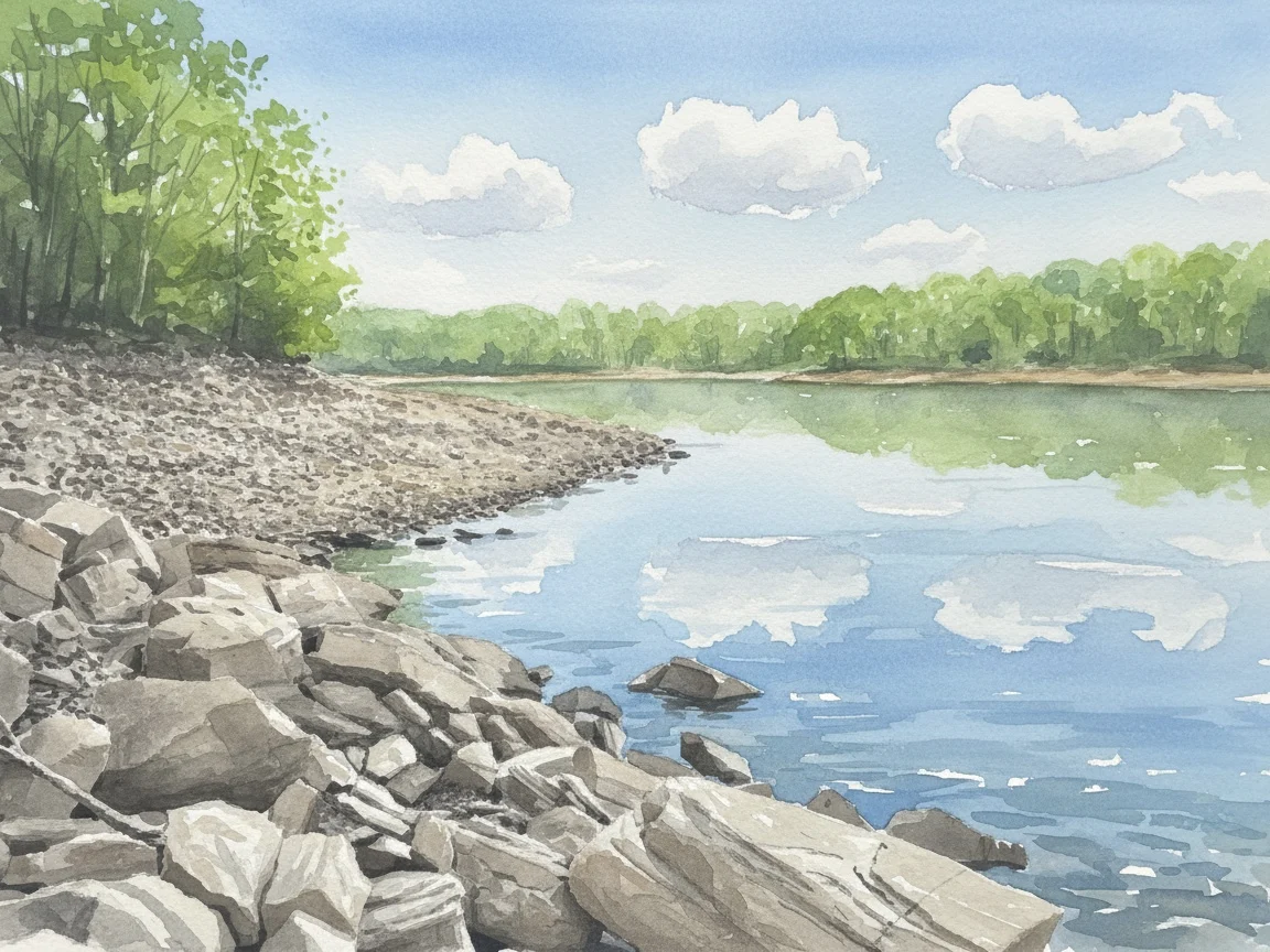
Estill Springs · 10 min 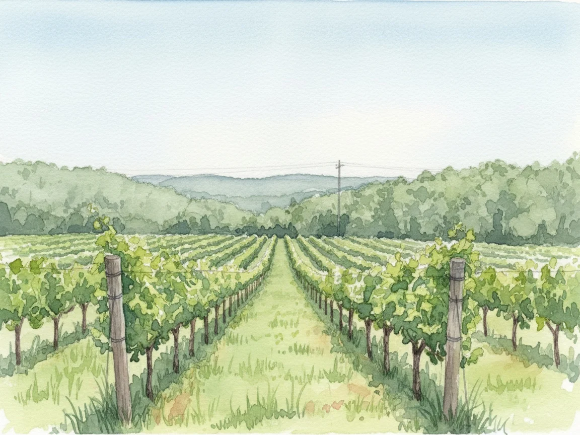
Huntland · 15 min 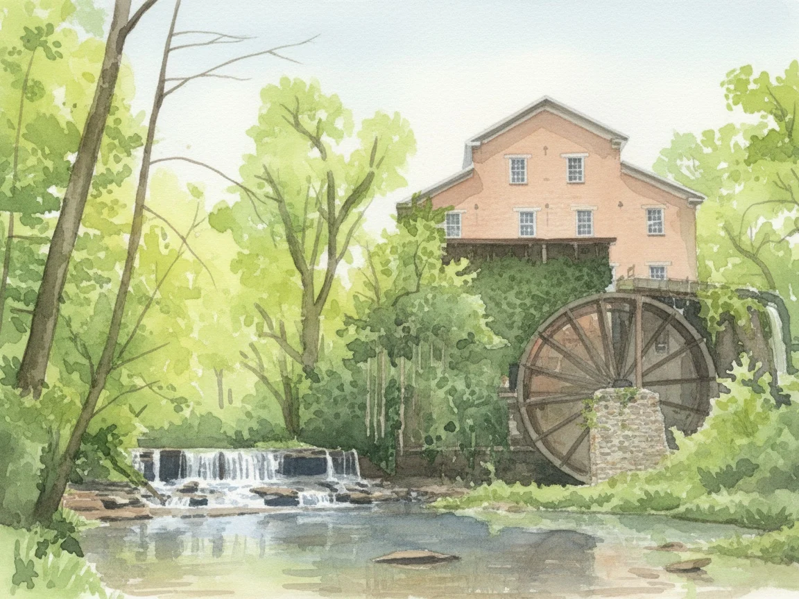
Belvidere · 15 min 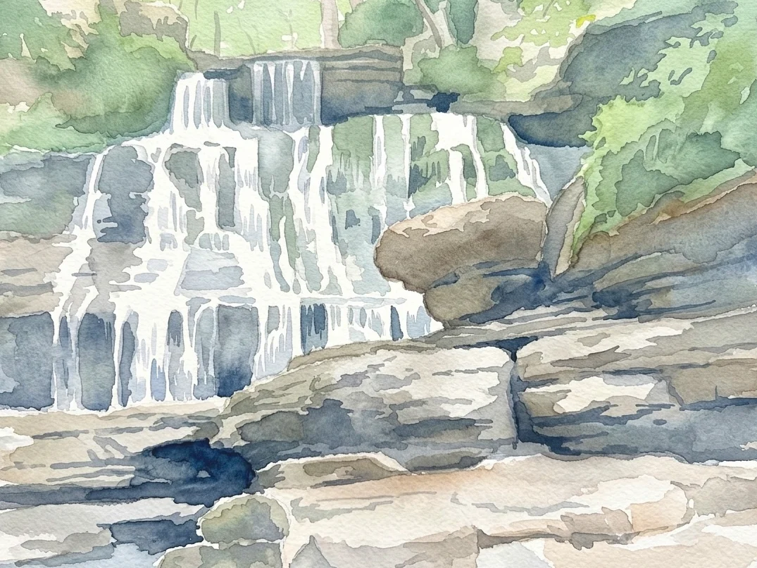
Tullahoma · 20 min 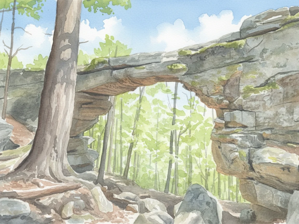
Sewanee · 20 min 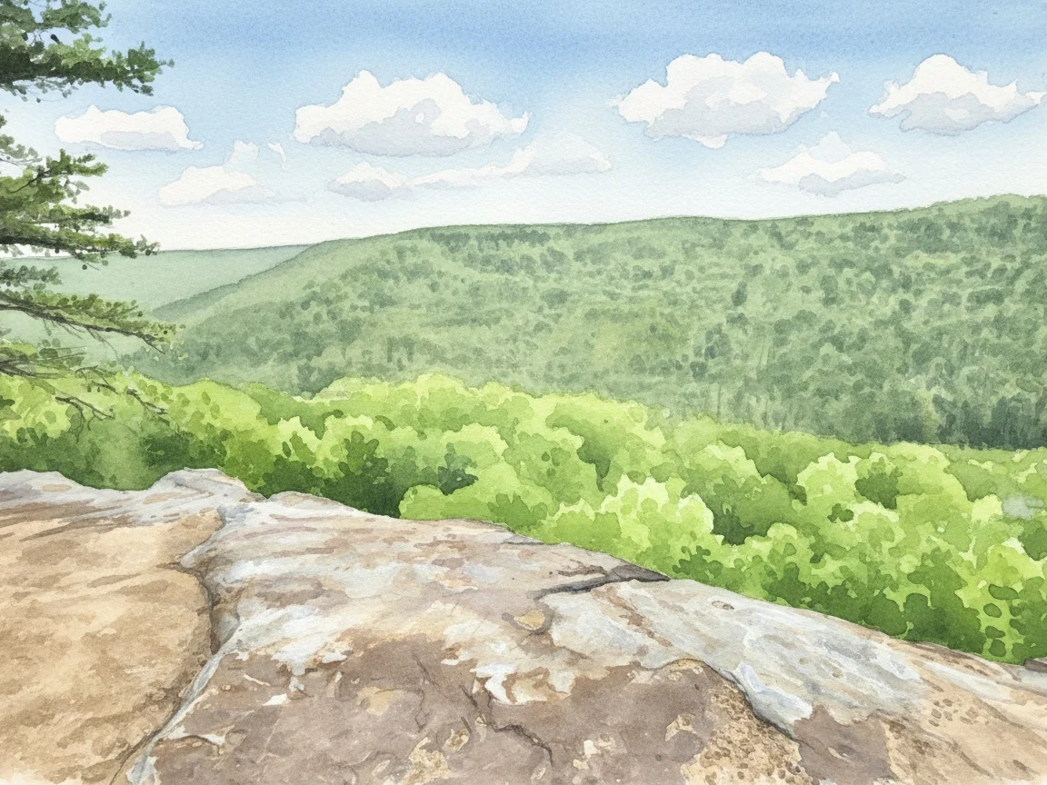
Monteagle · 25 min 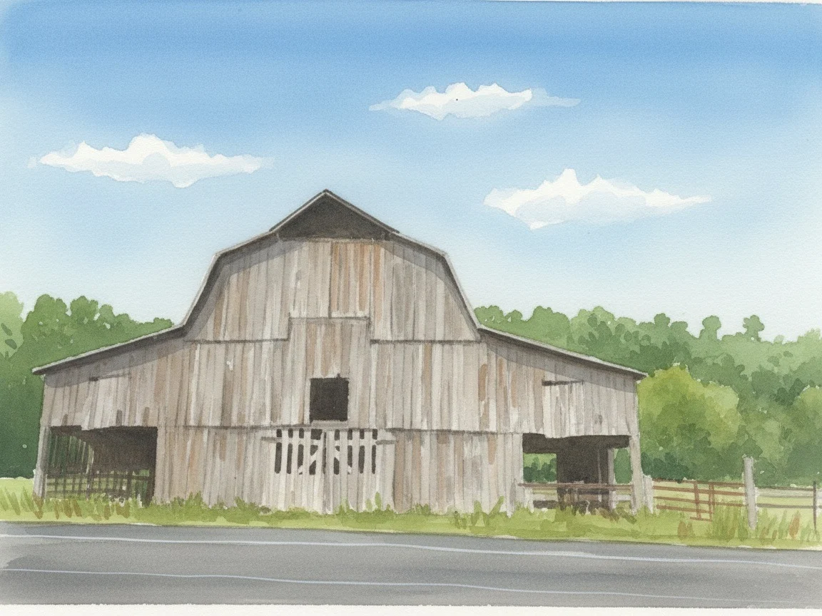
Lynchburg · 25 min 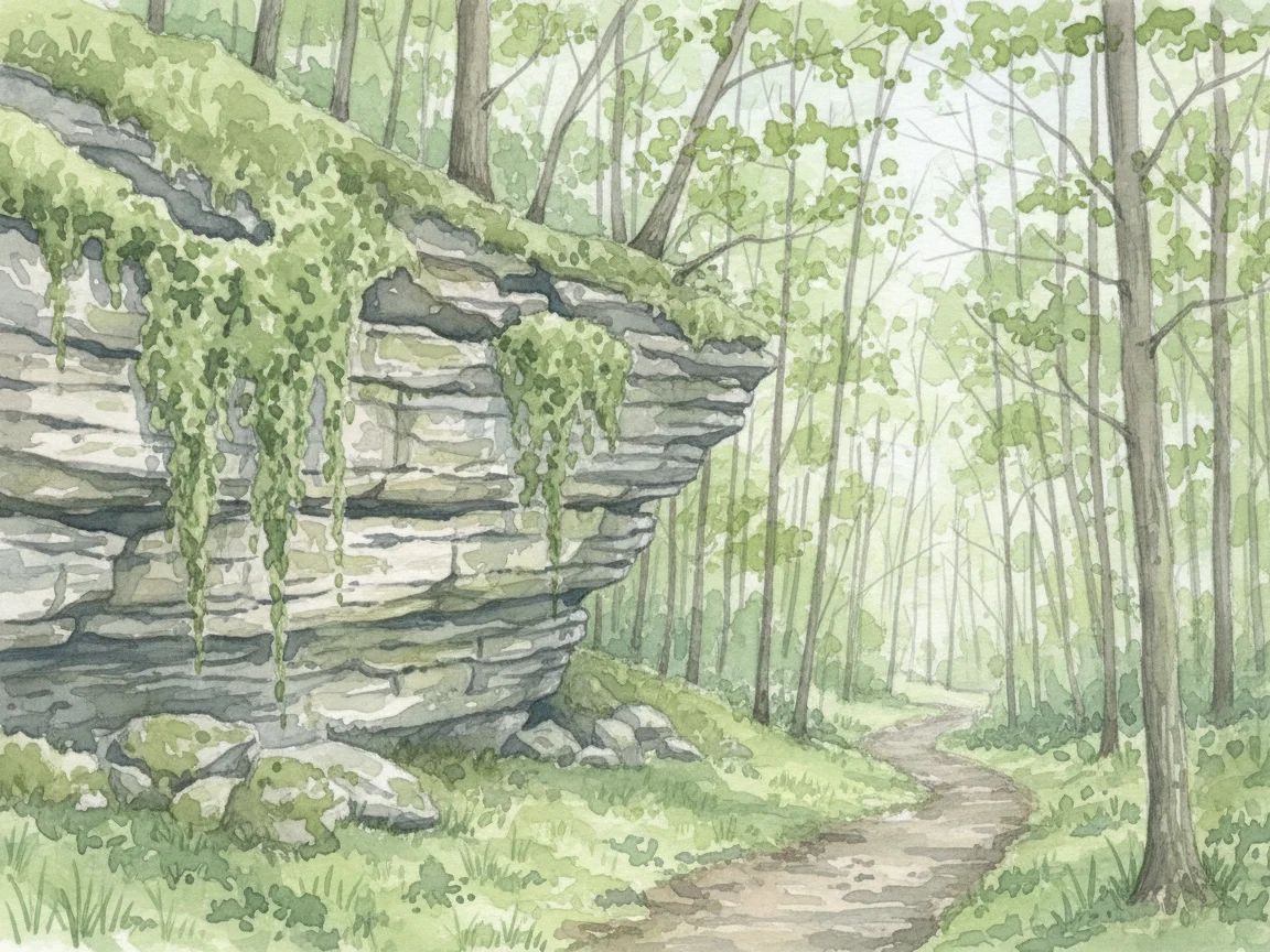
Manchester · 25 min
Ten places, nearest first
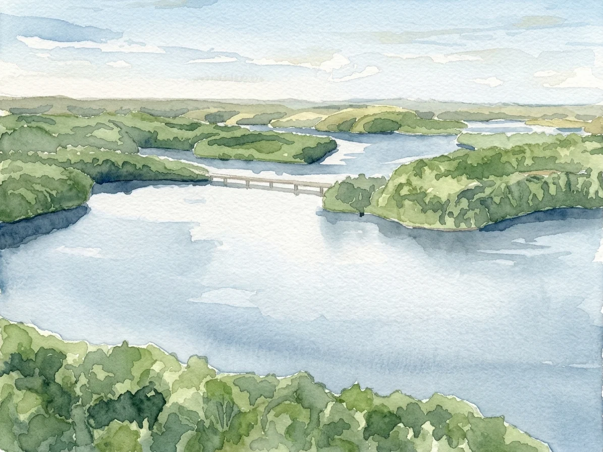
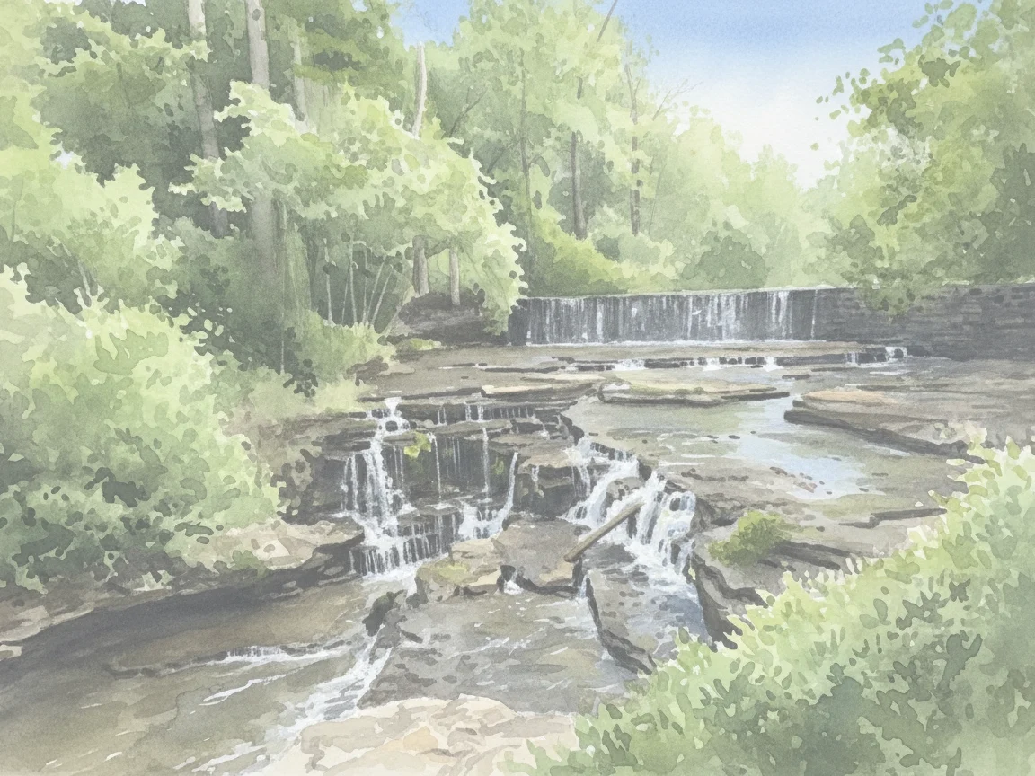
Ten paintings of places within half an hour of the office: Tims Ford Lake, Falls Mill, the Natural Bridge at Sewanee, the bluff at Manchester. Each carries its drive time, so the row shows the practice’s real service area and answers the first question a new patient has: how far is it from me? They sit on the home page, the contact page and the service pages.
Holistic and biologic dentistry in Winchester
Holistic dentistry looks at your mouth as part of the rest of you. Here that means the same exams and the same dentists, with more choices about what goes in your mouth and more time to talk about how your medicines, diet and sleep show up in it.
“Biologic,” painted live
Biologic dentistry is Dr. Orr’s own term, so its page opens on the word itself. Green and ink bleed in, the two halves close, and the whole word turns green as the reader arrives. It is the only paint on the site that moves, and it holds still for anyone whose phone is set to reduce motion.
What changed for patients
Four decisions, each aimed at getting the right patient to call, shown on the old site and the new.
Call to Book on the first screen
About half the practice’s visitors arrive on a phone, and the conversion that matters is a phone call. The old home page blurred its photo under white text and left a third of the screen as a smear above the buttons. Now the photo is sharp and Call to Book is under your thumb before you scroll.
Reviews filed by what you’re worried about
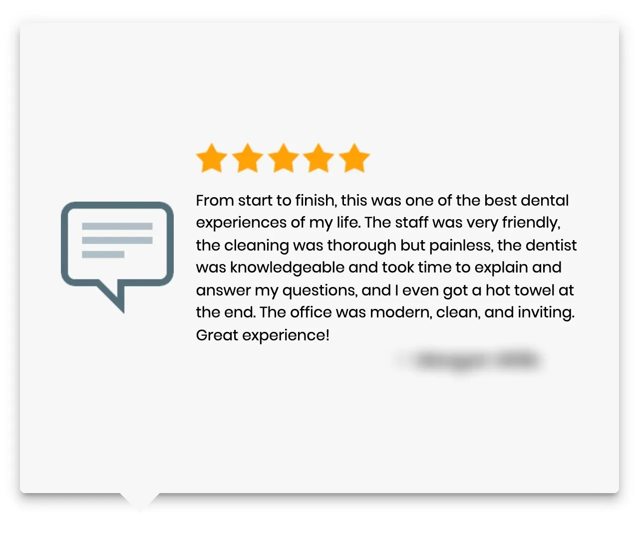
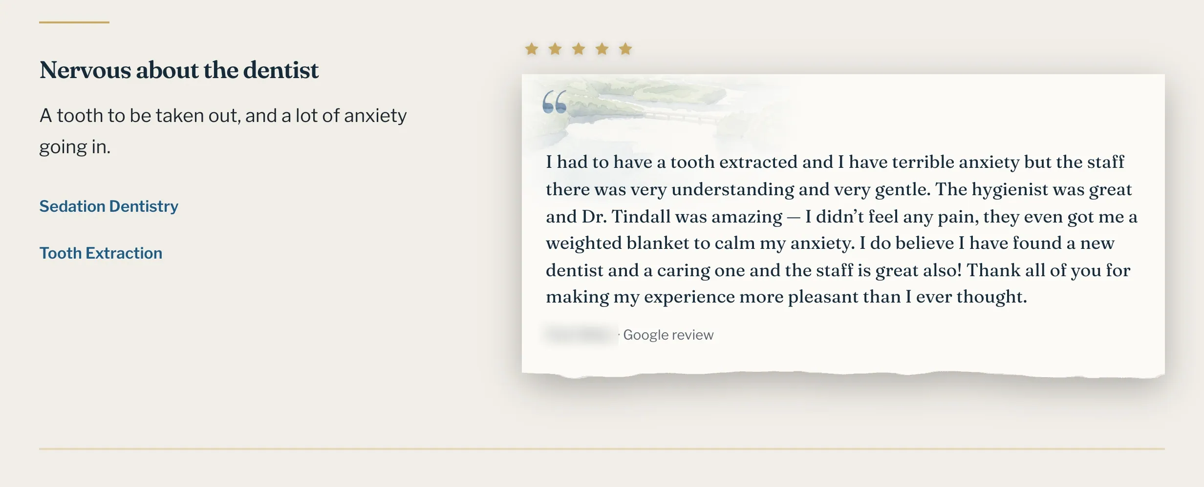
This is objection handling. Someone nervous about the dentist reads reviews looking for one person who felt the same. The old site showed one review at a time in a carousel. Now each review sits under the situation it speaks to, like “Nervous about the dentist”, with a link to the care that fits.
Accessibility that keeps the page intact
Accessibility matters more on a medical site, where patients with aging eyes or unsteady hands still need the hours and the number. The old site’s version painted black boxes behind every line and broke the page apart. Ours darkens the text, enlarges it on request, and leaves the layout where it was.
A services page you can read
The old services page was blue edge to edge, with two search boxes, seven cards of article titles and four paragraphs saying the practice offers dental care. The new one sorts services by search intent, into three groups by why you came, gives each service its own page with a photo of the work, and ends on one line: if you are not sure which of these you need, call and ask.
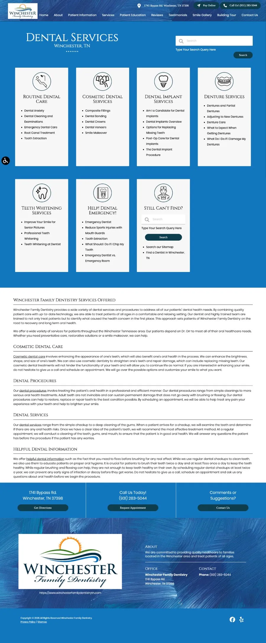
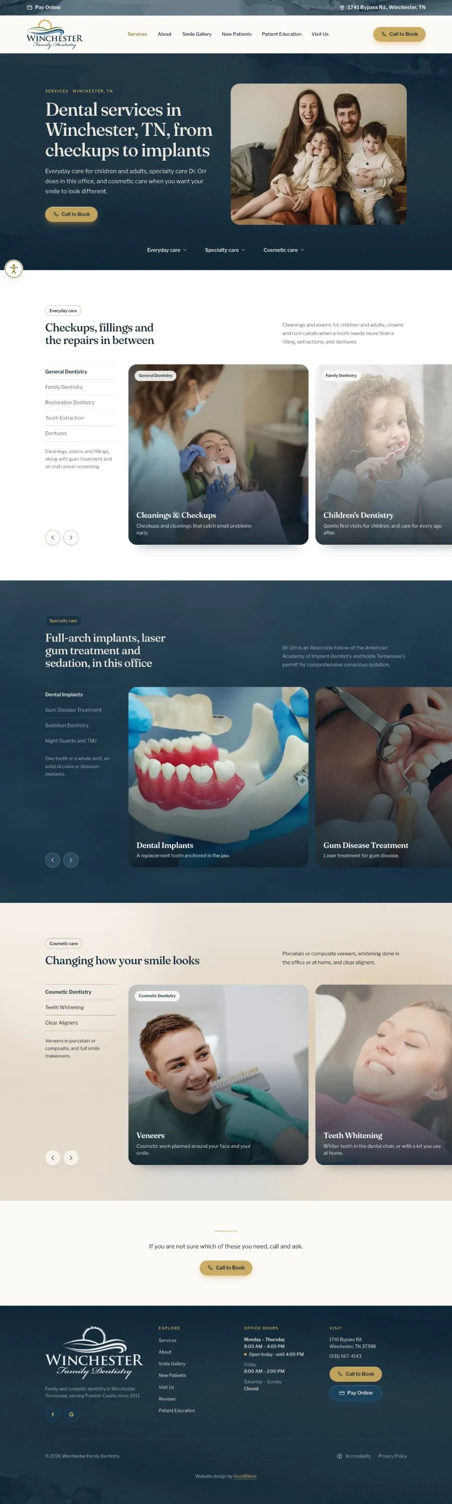
Scroll either page and the other follows.
Where the colors came from
The blues from the logo. Everything warm from the practice’s own hallway.
Specialty dental care, here in Winchester, TN
Procedures our neighbors drive an hour for happen in Winchester, TN. Same dentists you already know.
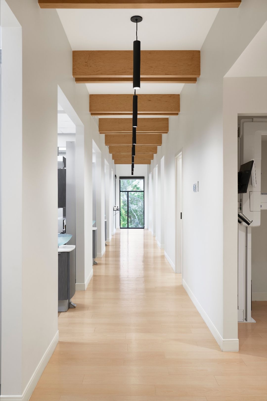
- Deep, paintedFrom the logo
- InkFrom the logo
- BlueLinks and focus
- GoldFrom the beams
- SandFrom the oak floor
- PorcelainFrom the walls
- GreigeBetween wall and floor
The logo keeps the brightest colors, its sun orange and hill green, so it stands out wherever it appears.
The whole site, old and new
41 pages, every one built for this practice. Scroll the screen to see the home page, then pick a page below to see it against the old one.



If your website looks like everyone else’s in your trade
We start with a conversation about your business and the people who walk in your door, then show you a plan before anything is built.
If you are on a template you can’t get off, we move you without losing what it earned on Google.